What an engineer taught me, a designer, about color
We are currently working on a redesign of a new client’s logo and graphic system. An important part of the system is color. Color gives the brand individuality, expressiveness and consistency.
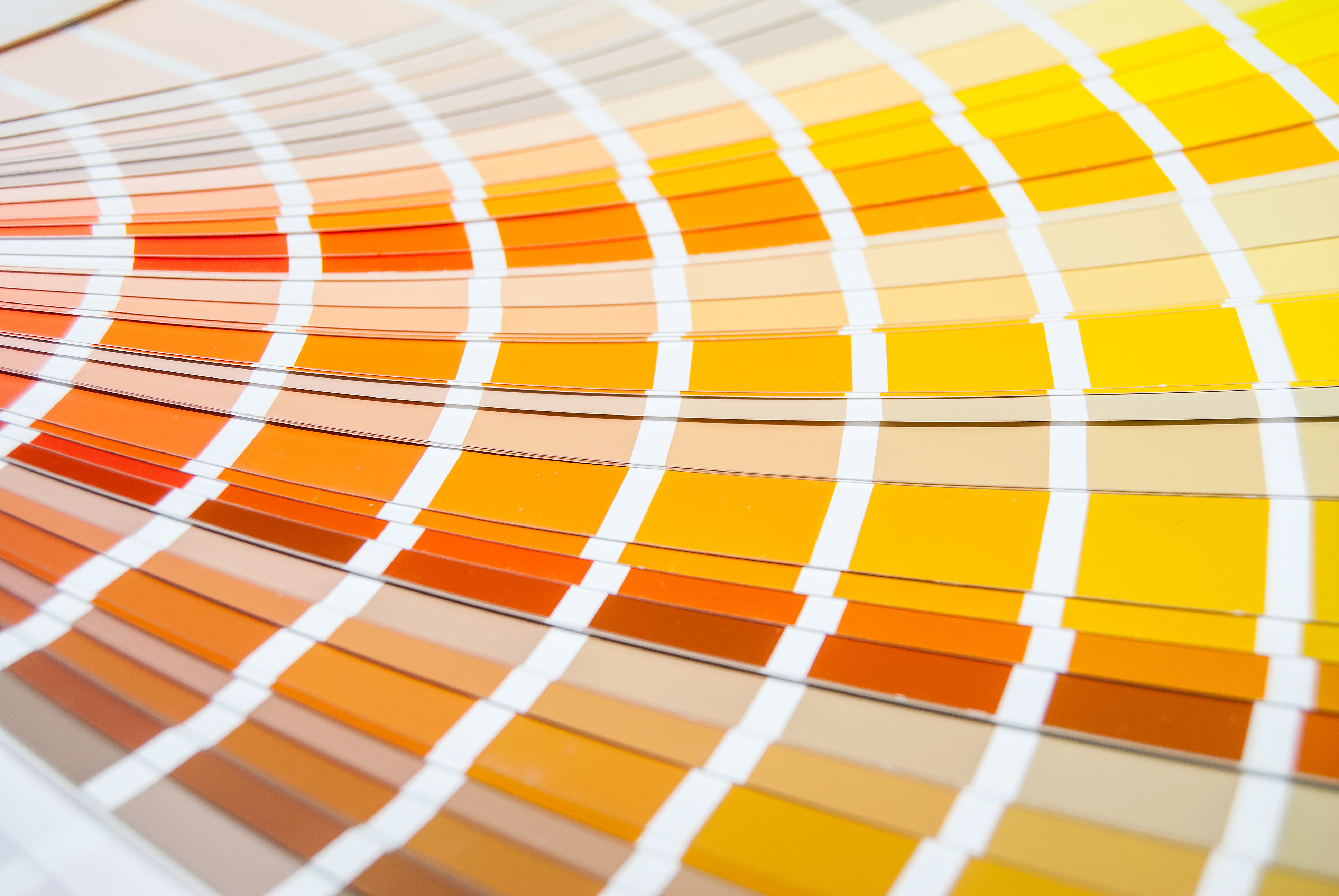
Orange was chosen for the brand’s logo color. Our original pick was a subtly darker shade of orange instead of the fully saturated color. The client wanted a brighter orange. No problem. To make sure we were all judging the same color, I FedExed a series of Pantone color chips, which are similar to paint samples you’d get at the hardware store. Having the exact color in both our hands meant there would be no discrepancies due to judging the color from different computer monitors or hard copies from a variety of printers. The client agreed with our recommended color. This is where the story really begins.

Variations of a Pantone Color
A few days later the client, an engineer, said he had a problem with the newly chosen orange. He stated that, while it looked great printed, it was washed out when viewed on a monitor. Now engineers tend to be folks who like to know all the details of how something works. Choosing colors I found out is no different.
Our client looked behind the graphics curtain to check out the Pantone color matching system. He found what’s been the major challenge for us designers for decades—trying to find consistency in color both on computer screens as well as on the printed page. He used, to my astonishment, the graphics program Adobe Photoshop to put together a comparison test with a group of Pantone oranges. Color swatches were placed side by side next to the logo along with lines of type set in the colors. A Word document was also developed to see how the colors behaved in that program. He was incredibly thorough.
With this input I was able to create my own tests. The client and I then met to determine which variations of the same Pantone color worked best on the screen and printed. (Believe it or not there are at least eight different Pantone systems to view and interpret THE SAME Pantone color—each looking differently on monitors and printouts.)
Color is processed in the artistic, visual right side of the brain. The engineer demonstrated to me that sometimes adding a bit of left-brain analytics could produce a successful WHOLE brain solution.
One Comment
Hi, this is a comment.
To delete a comment, just log in and view the post's comments. There you will have the option to edit or delete them.